
Pride in London changes brand direction
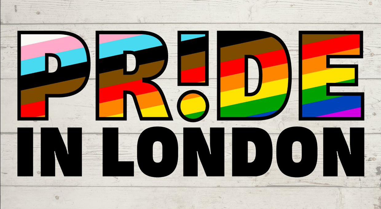
Pride in London has unveiled a new brand direction and visual identity, which is designed to put community, history and activism front and centre, and integrates the organisation’s key values of visibility, unity and equality.
The redesign to the Pride in London logo uses an exclamation mark as the third character in the word Pride, symbolising queer defiance, resilience and solidarity.
Pride in London will also use photography within the words as a “window”, ensuring that LGBT+ people are at the heart of the brand.
Tom Stevens, Pride in London’s Director of Marketing, said: “Our new logo and brand identity are more than just a facelift – we knew our brand had to reflect who we want to be, what we represent and who we stand for. This new brand direction will serve as a reminder that Pride in London is a platform for all LGBT+ voices and a force to drive positive change for all queer communities through visibility, unity and equality.
““Above all else, it’s vital that we as LGBT+ people remember our roots in activism and community, and that our people are always at the forefront of everything we do.”
Pride in London is also asking the LGBT+ community how Pride in London should be celebrated this year, in the event of the Covid restrictions being eased.
To answer their survey go to Pride in London